When I first discovered the transformative power of complementary color scheme interior design, it felt like unlocking a secret code to visual harmony. Pairing colors opposite each other on the color wheel creates dynamic spaces that captivate and energize. This approach isn’t just about aesthetics; it’s a strategic way to enhance mood and functionality in any room.
Exploring complementary color scheme interior design can be a game-changer for anyone looking to revamp their living space. By balancing bold contrasts, these color duos—like blue and orange or red and green—can breathe new life into an otherwise ordinary room. Whether you’re aiming for a cozy retreat or a vibrant social hub, understanding these color relationships is key.
Incorporating complementary colors into your home doesn’t require a design degree. With a little guidance, anyone can master the art of creating visually stunning interiors that reflect personal style while ensuring a cohesive and inviting atmosphere.
Key Takeaways
- Complementary color schemes involve pairing colors opposite each other on the color wheel, creating vibrant and dynamic spaces that enhance mood and functionality.
- Complementary pairs like blue and orange or red and green can breathe new life into a room by providing bold contrasts and visual interest.
- Proper application is crucial to avoid a jarring atmosphere; balance between primary and accent colors can be achieved with accessories and artwork.
- Understanding the interplay of warm and cool tones can help in setting the desired atmosphere, from cozy retreats to lively social hubs.
- When incorporating complementary colors, careful selection of primary and secondary hues, as well as room-specific applications, can achieve both unity and visual appeal.
Complementary Color Scheme Interior Design
Complementary color schemes involve pairing colors directly opposite each other on the color wheel. This arrangement creates a high contrast, vibrant look that can transform a space. Colors such as red and green or blue and orange are classic examples of these pairings. When used in interior design, they add energy and depth to any room.
There are specific benefits to using complementary colors. Visual interest increases as these colors enhance each other’s intensity, making the design elements stand out. Additionally, the balance between warm and cool tones can harmonize a room, helping to set the desired mood whether serene or lively.
However, it’s essential to apply these schemes with precision. Overuse can result in a jarring atmosphere, so proportional use of primary and accent colors is crucial. For instance, incorporating accessories or artwork in complementary colors can achieve harmony without overwhelming the space.
Understanding and integrating complementary color schemes can elevate interior design while catering to each individual’s style preferences.
Advantages of Using Complementary Colors

Complementary colors enhance aesthetic appeal and create visual harmony in interior spaces. They bring balance and dynamic energy to a room.
Enhancing Aesthetic Appeal
Complementary color schemes boost the aesthetic appeal by creating striking contrasts. These contrasts make the features of a room pop, drawing attention to specific design elements. Using pairs like blue and orange or yellow and purple, I ensure that every piece stands out, adding depth and interest. The interplay of these colors livens up spaces, providing a cohesive yet vibrant atmosphere that captivates without overwhelming.
Creating Visual Harmony
Visual harmony results from the strategic use of complementary colors. This harmony is crucial for achieving a balanced interior space that feels both dynamic and comfortable. By pairing colors that naturally oppose yet complement each other, I establish a sense of unity among different elements in a room. This unity prevents any part of the space from dominating, ensuring an even flow throughout. Using thoughtful accessories or artwork, I can reinforce this balance, pulling the whole design together seamlessly.
Choosing the Right Complementary Colors

Complementary color scheme interior design, central to impactful interior design, involve selecting the right pairings for a harmonious yet dynamic space. I focus on primary and secondary colors in combination with warm and cool tones.
Primary and Secondary Colors
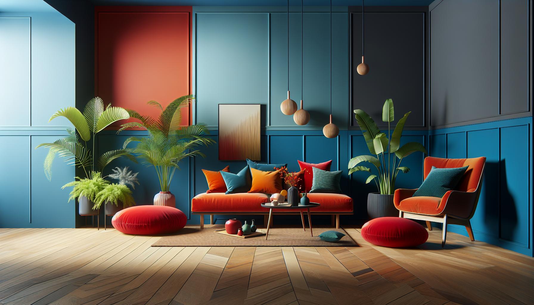
Primary colors set the stage for complementary design. Blue, red, and yellow form the basis. When paired with secondary colors—orange, green, and purple—each primary color finds its opposite. I choose a primary hue and match it with its complementary secondary color to create contrast. For instance, a blue wall complements vibrant orange accents perfectly. Balancing these elements ensures high visual impact without overwhelming the senses.
Warm and Cool Tones
Warm and cool tones refine the mood. Warm tones, like red and orange, energize and create an inviting feel. Cool tones, such as blue and green, bring calm and sophistication. I mix warm tones with their complementary cool counterparts to achieve balance. In a sunny room, I might use a cool backdrop for warmth-infused decor pieces. This approach leverages temperature differences for aesthetic depth, ensuring visually compelling and comfortable spaces.
Implementing Complementary Colors in Different Rooms

Integrating complementary color schemes in various rooms can elevate interior design by introducing vibrant contrasts. Thoughtful application of these schemes enhances a room’s functionality and visual appeal.
Living Room Ideas
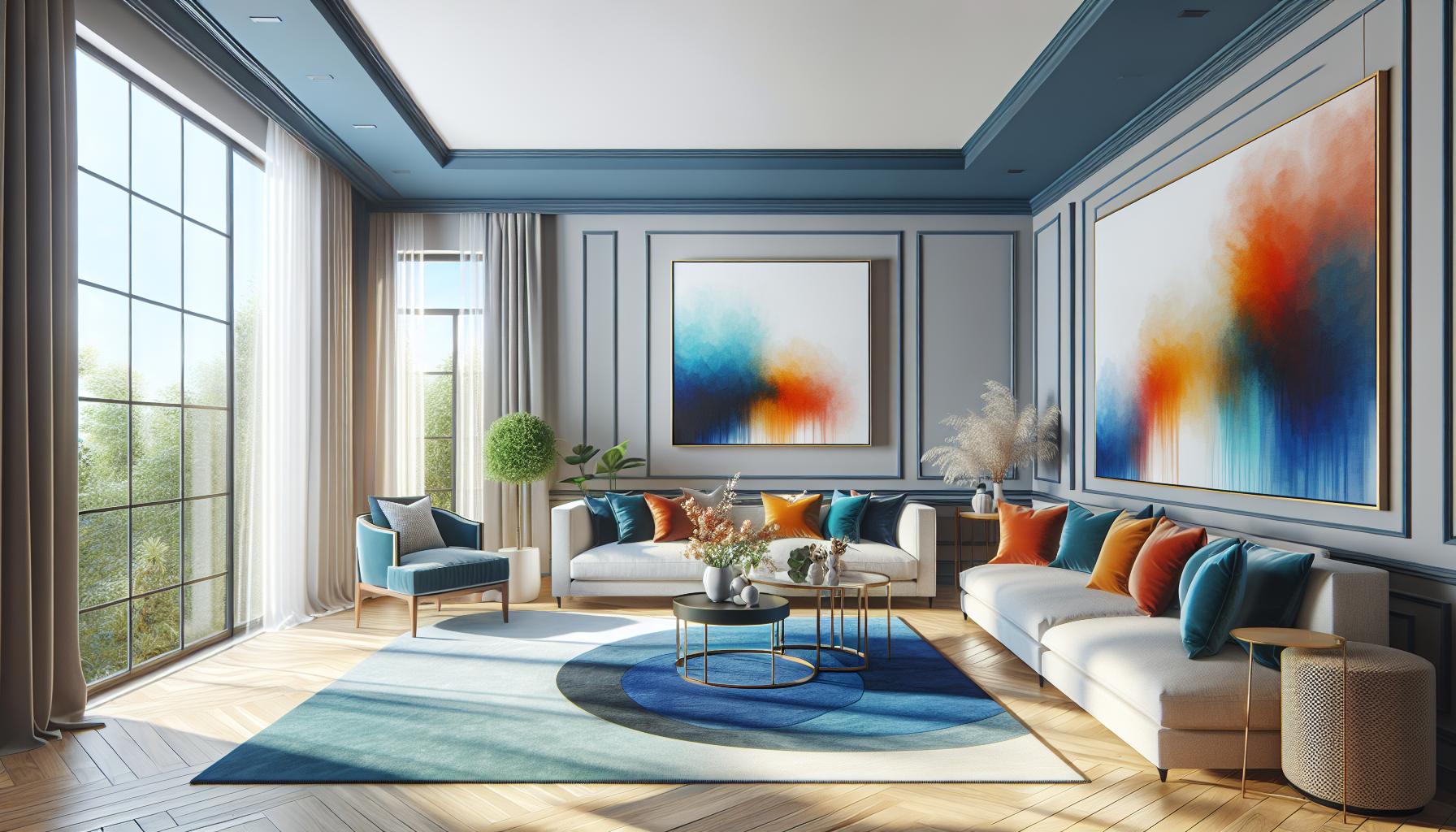
Choosing the right duo for a living room sets the atmosphere. Blue and orange, for example, create a dynamic contrast, enhancing the room’s vibrancy without feeling overwhelming. Walls painted in a neutral shade, combined with orange and blue accessories or furniture, maintain balance. If the room receives a lot of natural light, incorporating lighter shades of these colors ensures the space feels airy yet cohesive. An accent wall or bold artwork can serve as focal points, drawing attention and adding depth.
Kitchen and Dining Spaces
Color pairing in kitchens can invigorate the cooking and dining experience. A red and green color scheme, for instance, can add energy and freshness. Red accents through bar stools or cabinetry inject warmth, while subtle green tones in tiles or decorative items provide balance. In dining areas, using complementary colors on table settings or curtains ties the space together seamlessly. These elements help create an inviting atmosphere for dining and socializing, especially if combined with an appropriate mix of materials and textures.
Bedroom and Bathroom Suggestions
Calmness prevails in bedrooms with a purple and yellow scheme. Soft purple on walls paired with yellow in textiles or lighting fixtures fosters relaxation and balance. In bathrooms, the same color pair can evoke luxury; consider purple tiles contrasting with yellow towels or accessories. The key is subtlety, using pastel shades or subdued hues to maintain a serene environment. This approach ensures restful and rejuvenating experiences in these personal spaces.
Challenges and Considerations
Navigating complementary color schemes for interior design requires careful planning to avoid pitfalls that may disrupt the intended ambiance.
Avoiding Overcrowded Designs
Complementary colors can create dynamic spaces, but using too many can overwhelm. I focus on controlling color saturation and limiting the number of bold hues. For example, in a living room, I might pair bold blue and orange with neutral elements like white or beige to prevent overcrowding. Proper spacing between these colors maintains visual clarity and avoids a chaotic feel. By prioritizing simplicity, I ensure that the complementary scheme enhances rather than suffocates the space.
Balancing Accents and Base Colors
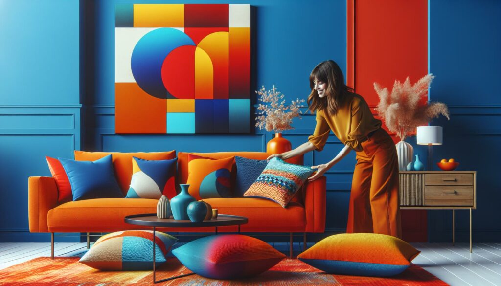
Integrating complementary colors necessitates a harmonious balance between accents and base colors. I often choose a primary base hue for walls or large furnishings, complemented by accent colors in smaller elements like pillows or artwork. For instance, I might select a soft green as a base and incorporate red accents through decorative items, maintaining balance while ensuring visual interest. By carefully managing proportions, I create a unified design that allows accent colors to stand out without overpowering the overall aesthetic.
Color Scheme
Embracing complementary color schemes in interior design offers a dynamic way to refresh any space. By strategically pairing opposite colors, we can create environments that are both visually striking and harmonious. The key lies in balancing bold contrasts with neutral elements to maintain clarity and avoid overwhelming the senses. Whether you’re looking to energize a living room or create a tranquil bedroom retreat, complementary colors provide the flexibility to tailor spaces to your personal style. With careful planning and a touch of creativity, anyone can transform their home into a vibrant and inviting haven.

